Gargoyle Airbrushing
Design
I had an idea to do a hoodie with a dragon or something, and so I started sketching something in Photoshop. I have a graphics tablet, and it's easier for me to sketch ideas that way. With Photoshop you can layer, reposition, resize, rotate, warp, etc., which is quite a timesaver as opposed to pencil and paper where you would either have to erase and completely redraw or retrace and redraw with every change.
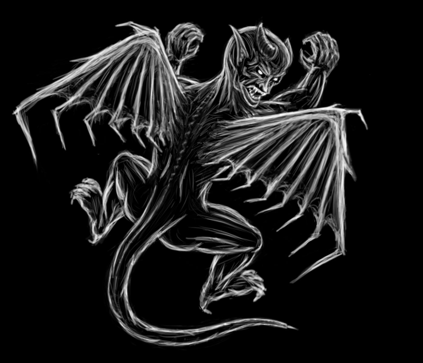
First sketch, all from memory, absolutely no picture references. I find if I start looking at picutres too early, I start copying way too much instead of doing what was in my mind in the first place. I don't know if it's autopilot or laziness. Either way this gets the angles and such of what I had in mind first. Since this is going to be on a dark shirt, sketching it out in white against a black background.
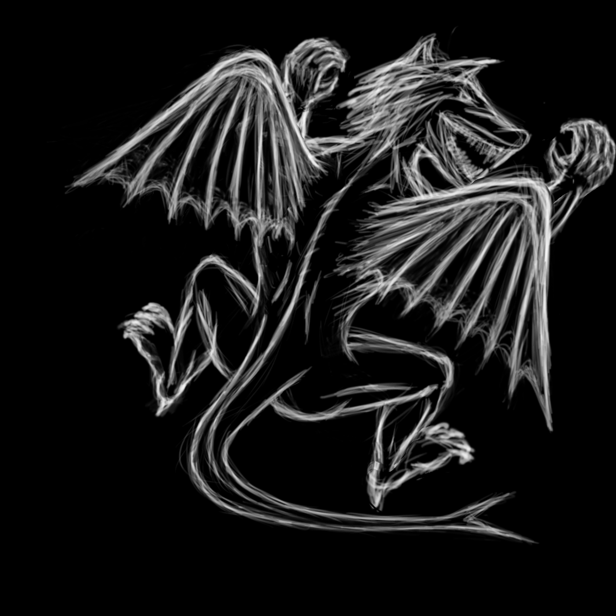
Turned from a dragon into some kind of werewolf-gargoyle hybrid. I could change it so it's more of a dragon/serpent, but I think I want to go the gargoyle route. In that case, changes are needed:
- Don't like the head at all, when trying to do a dragon from memory it went into the direction of a wolf. So that's going to have to be more demon/gargoyle like.
- I like the angle, pretty much that's the stance I want, maybe some tweaks to the legs needed...maybe so he's squating more.
- Wings are way too angelic - they need to be more boney, harsher angles, and claws added.
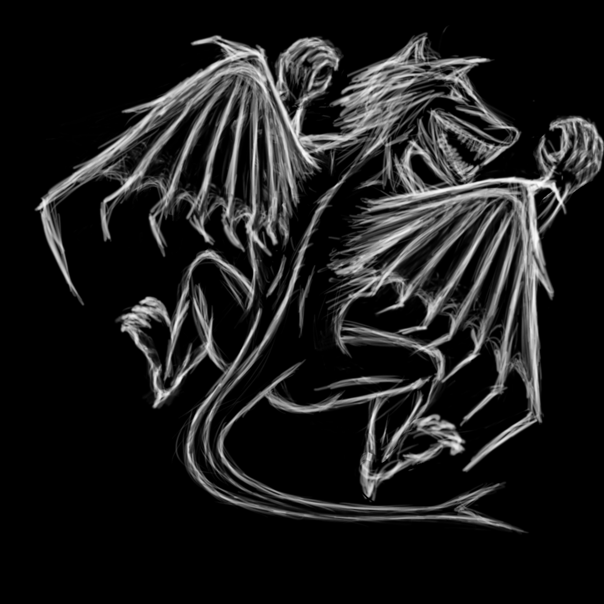
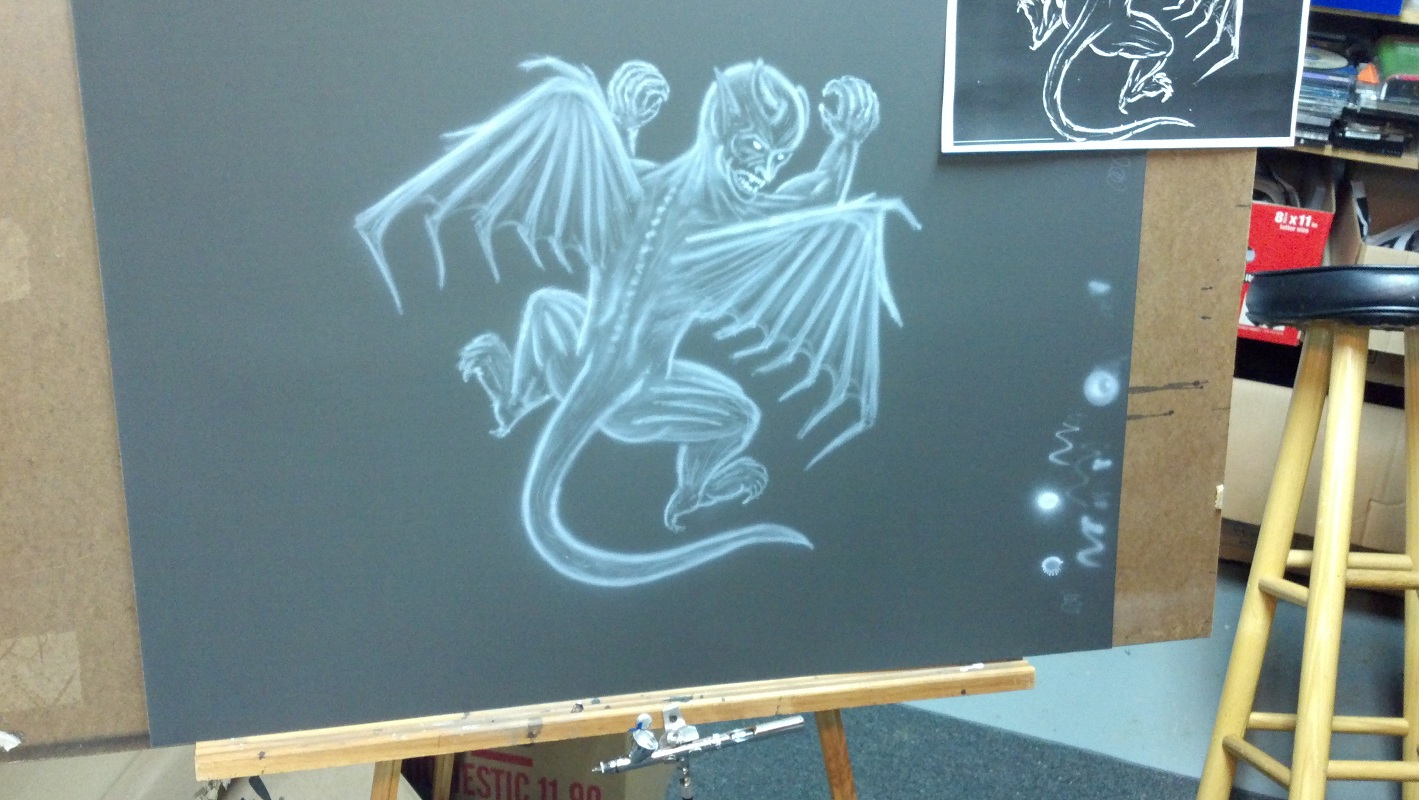
Wings revised, like that look way better.
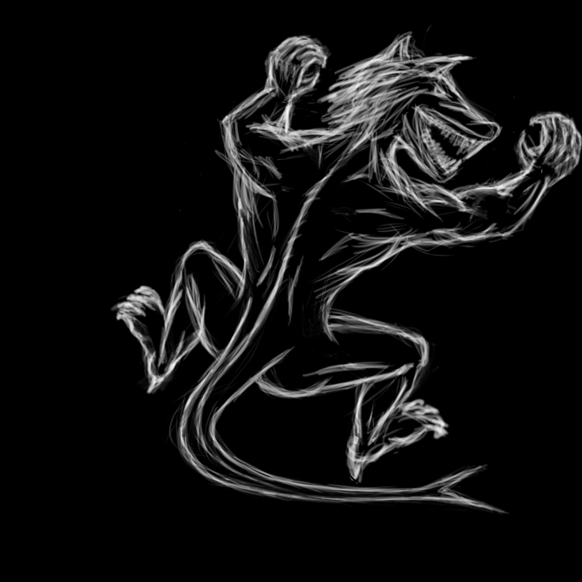
Since this is now a gargoyle, the head is actually going to be more human-like, so sketched in a human head, trying to get the right proportions and angle.

Repositioned the right arm and leg, as well as extended the right wing, giving a better flow and keeping the lines from the wing from interupting with the limbs too much. Changed the tail. Still haven't used picture references yet, waiting until I've exhausted what I can pull from my imagination.
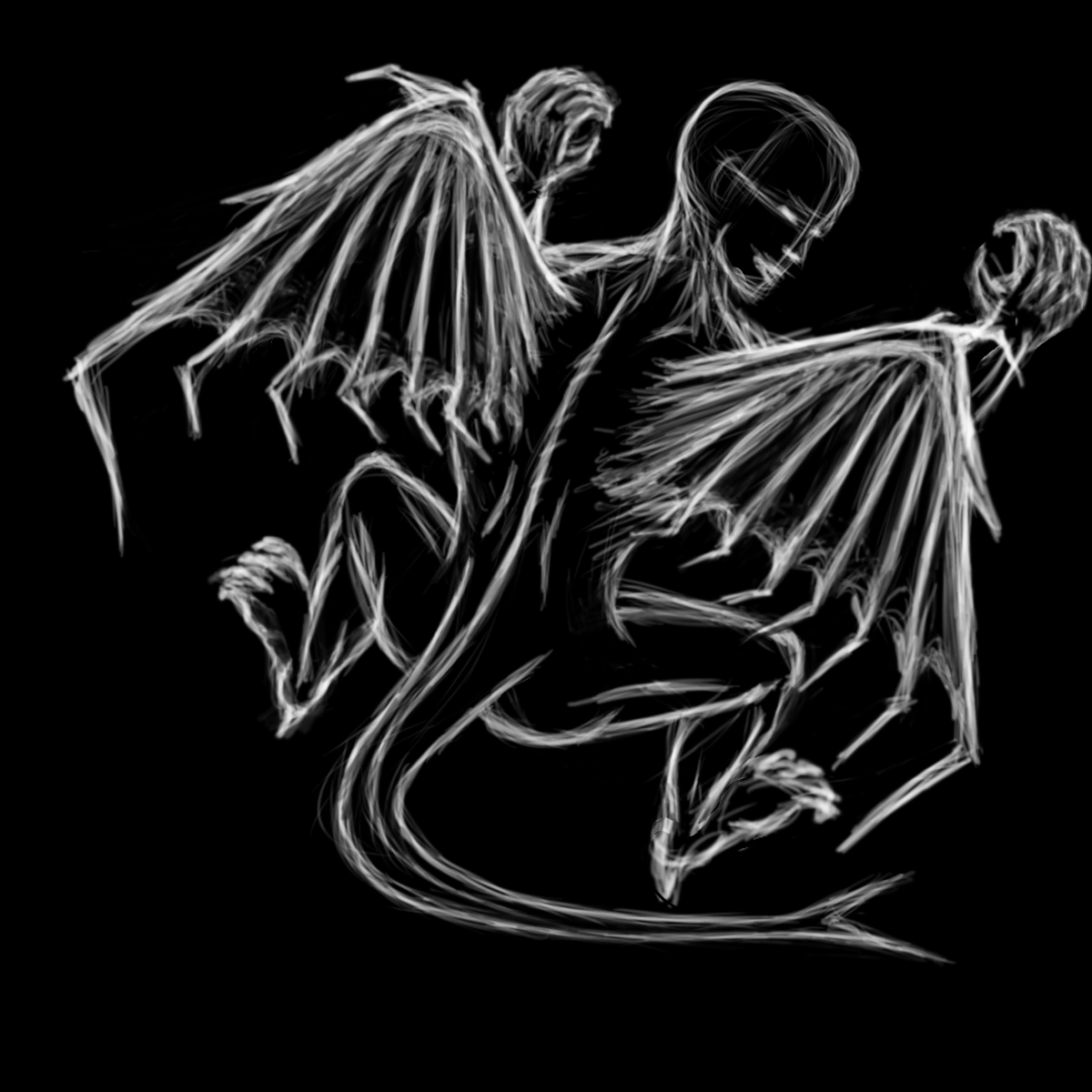
Looked at pictures of gargoyles for reference for the face. Sharp features, elongated ears, and horns seem to be the norm, so used those . Cleaned up some elements, fleshed out others.
Transfer
The next step is to transfer the design. I don't have a fancy digital projector, so I'm just going to trace it on to some tracing vellum. In order to do this, I use a poor-man's lightbox - my big screen TV. Ok, a poor man isn't going to have a big screen TV. Guess I should say "make-shift." Also the TV has a Linux PC hooked up to it, but most laptops have HDMI out and TV's now have HDMI input, so it could be done that way as well.
After tracing the image, the next step is to poke holes through the vellum. I use a mechanical pencil to make the holes, as the lead is just the right size. I place the vellum on a rug that has a very short fiber length, so that it doesn't have much give to it. This way when I poke the holes it's keeping the rest of the vellum reinforced, whereas if it was say a shag carpet the vellum would wrinkle around where you were trying to put a hole. This part is both time-consuming and quite boring, not to mention uncomfortable since you have to be laying on the floor in order to do it. I should probably get a carpet scrap of the right size and place it on a table in the future to alleviate that.
Now to airbrush over the holes to transfer the image onto the canvas. This part is pretty easy. However, you still have to make sure you don't airbrush too heavily, or else those dots will show up through your painting, which you don't want. It's easy enough to just undo the tape at the bottom two corners and lift up and look to see how it's coming along.
All said and done there's now a nice guide of my design to use when airbrushing.
Practice
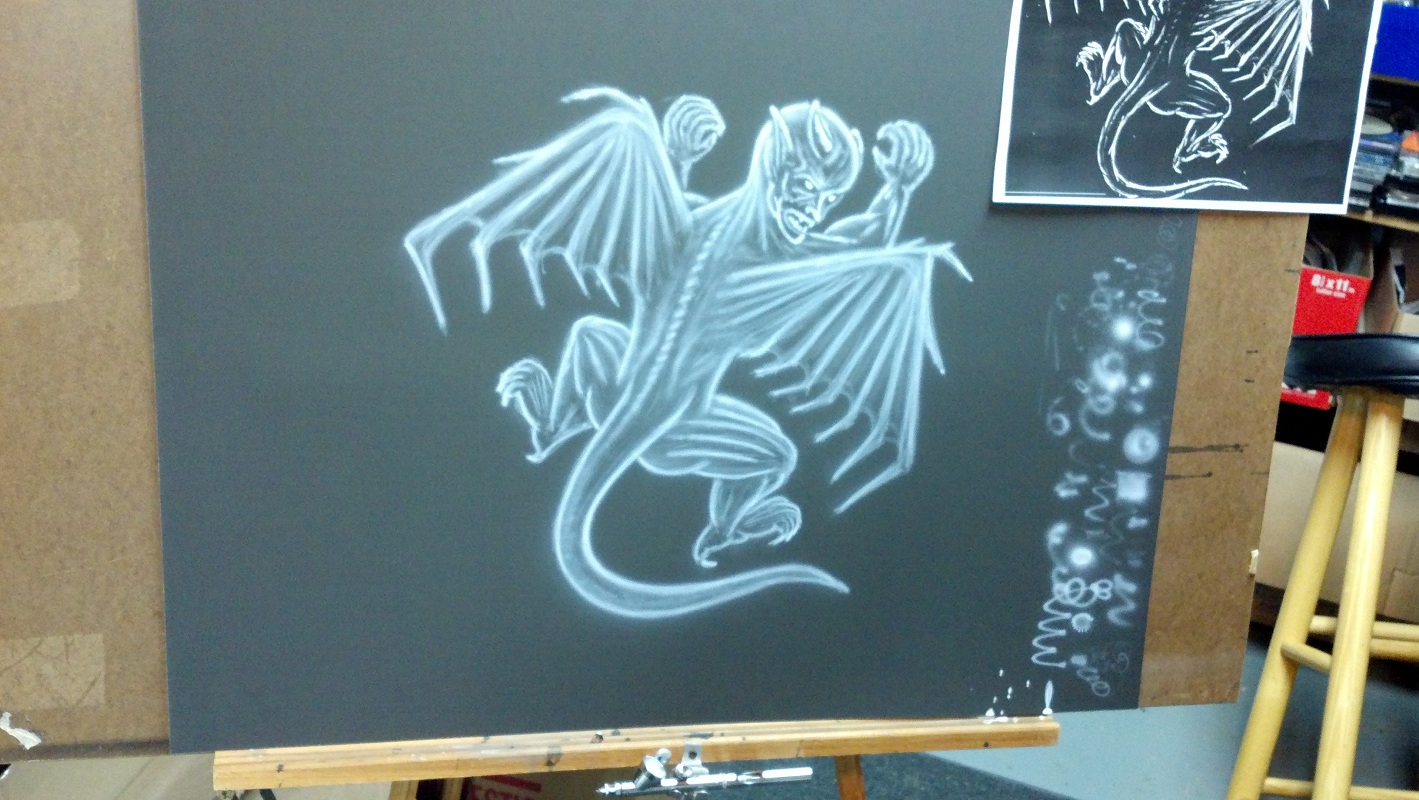
I've made it a habit to do a preliminary practice piece before doing the actual painting. This really helps because first, I don't use the airbrush on a daily basis, so this gets me back in the groove so to speak. Also, it helps show me where I need to concentrate if I make any mistakes or do things I don't like, or maybe even change things if I need to. Lastly, having done it once, I'm now in a position to do the finished piece with better confidence as I now know what I need to do having done it once already.
The first layer is done mostly to flesh out the guide. It is usally done lightly, with the paint mixed pretty thin so to limit it's contrasting strength. I use about 25% paint to %75 water mix, around 20 PSI.
The next layer is just building on the first, but laying it down heaver in those areas where you want to bring up the contrast. This is around 1/3rd paint to 2/3rds water this time around, with the PSI around 25. It's hard to tell in the photos the second from the first layer because the camera auto-adjusts the brightness so they look pretty similar. I tried taking the last one without the shop light to show the contrast but it made it more blurry.

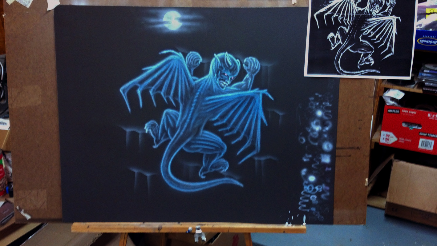
I decided I wanted a cold feel to it, so colored the gargoyle blue. Made the eyes red. Also thought it would be good to put some type of rocky cliff as a background for the gargoyle to be climbing, so he's not just suspended in dead space. I also wanted to put in the moon in the background, so did that as well.
Airbrushing
Now to put the design on the sweatshirt. I have to say, it takes a bit of rethinking when working on airbrushing clothing. First, the paint is usually thicker, so you use an airbrush that can push out more paint. This translates to not being as precise and detailed - which is hard for me, because I like to work that way as much as possible. So you have to make your images bigger and learn where your limits of details are when airbrushing fabric. In my practice piece, I purposely used my Omni instead of my Iwata since that's what I'm going to be using for the final piece. Even so, airbrushing on posterboard is still going to actually give more detail than airbrushing on fabric, so you have to take that into consideration as well. The layering and contrast also comes into play since the fabric can soak more of the paint below the surface.
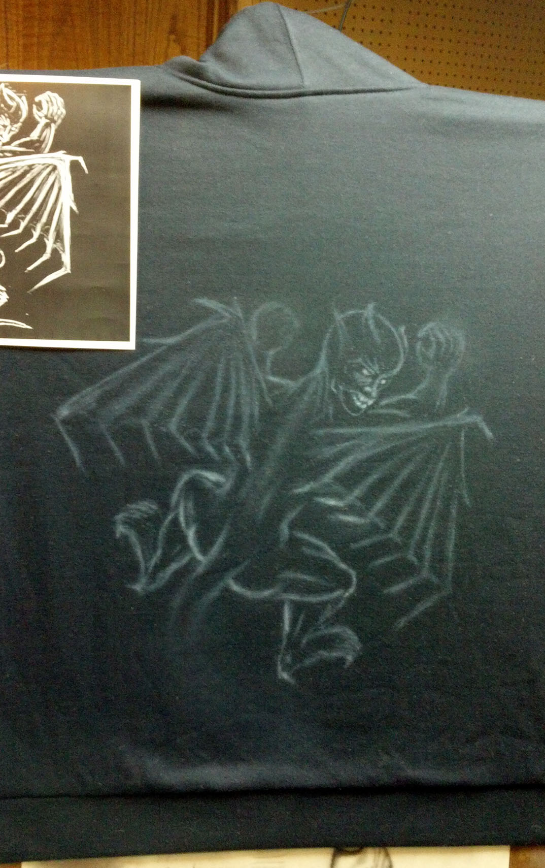
The first step is to mount the shirt on something sturdy and stretch it flat. I use a piece thin piece of hardboard that also doubles to hold paper that I tape to it to use as a canvas. I bought a generic dark blue hoodie to be used to put my design on. After mounting I use the same process to transfer the design, utilizing the same vellum. However, the holes were so small that they clogged with paint somewhat, so my image transferred only very lightly, and it some parts hardly at all. I really had to use my earlier image a reference and lightly laid down the first "sketching" layer of paint.
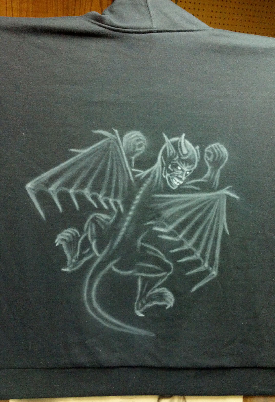
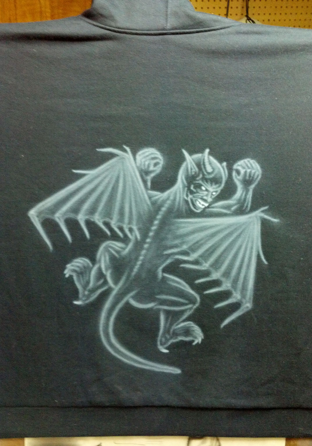
After that it's just a matter of layering more white paint in the same way I did with the practice piece. It's best to go as bright as possible, since the color layer will take away some of the contrast.
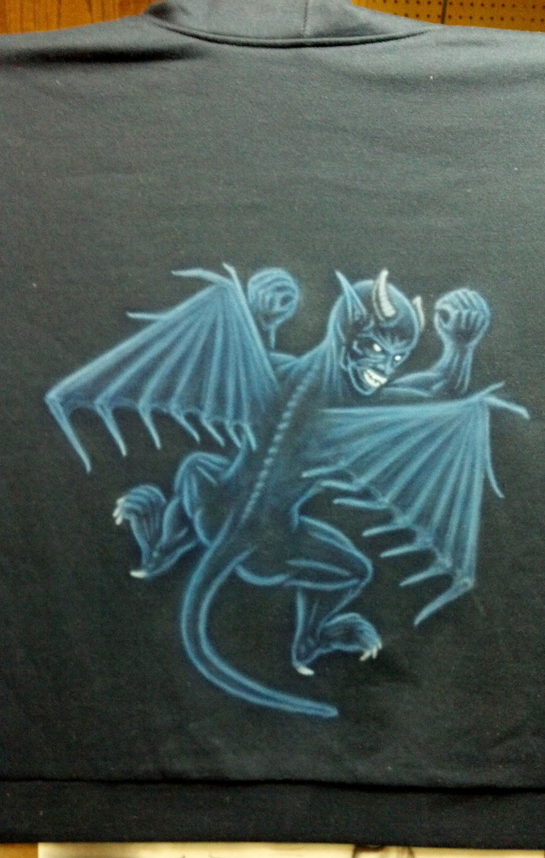
As in the same way of the practice piece, I add the color, the moon, cliff rocks, etc. I opted to shorten the tail a bit so it didn't conflict with the rocks under the right foot as much. I also used a darker shade of blue as I felt the blue in the practice piece was too bright. (The image is from a cell phone camera and shows the blue being brighter than it really is - the image of the finished piece has a truer representation of the coloring.) This is also why I do a practice run - to make changes and tweaks that I'd normally be stuck with.
After I'm happy with the finished piece, I set the paint by taking a heat gun and going over the entire painted area, making sure not to get too close or staying in one spot too long. After that I throw it in the dryer on high heat for a cycle, turned inside-out.
